Lighting design is a nuanced art that goes far beyond mere illumination. The choice of colour temperature in lighting reveals a deep understanding of human psychology, architectural principles, and the interplay between light and space. This crucial aspect of lighting design can dramatically influence mood, productivity, and the overall ambiance of any environment. From the warm, inviting glow of a cosy living room to the crisp, invigorating light of a modern office, colour temperature plays a pivotal role in shaping our perceptions and experiences within built environments.
Kelvin scale and its impact on lighting aesthetics
The Kelvin scale is the foundation for understanding colour temperature in lighting design. This scale measures the appearance of light, ranging from warm yellows to cool blues. Lower Kelvin values (2000K-3000K) produce a warm, yellowish light reminiscent of candlelight or sunset, while higher values (5000K-6500K) create a cool, bluish light similar to daylight.
Lighting designers use this scale to create specific atmospheres and enhance the aesthetic appeal of spaces. For instance, a high-end restaurant might opt for warm lighting around 2700K to create an intimate, luxurious ambiance. Conversely, an art gallery might choose cooler temperatures around 4000K to accurately showcase artwork colours.
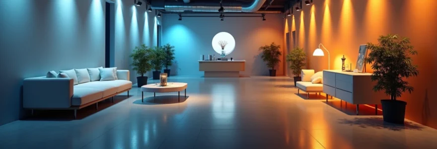
The impact of colour temperature on lighting aesthetics is profound. Warm light tends to make spaces feel more welcoming and relaxing, while cool light can make areas appear larger and more spacious. This effect is particularly noticeable in retail environments, where lighting can influence customer perception and behaviour.
Psychological effects of warm vs cool light temperatures
The psychological impact of colour temperature in lighting design cannot be overstated. Different light temperatures can elicit varying emotional and physiological responses, making them powerful tools for creating desired atmospheres and influencing human behaviour.
Circadian rhythm regulation with 2700K-3000K lighting
Warm light in the 2700K-3000K range closely mimics the natural light of sunset, triggering the body’s production of melatonin. This hormone is crucial for regulating our circadian rhythm, the internal process that governs our sleep-wake cycle. By using warm lighting in evening hours, lighting designers can create environments that promote relaxation and prepare the body for rest.
In residential spaces, this principle is often applied in bedrooms and living areas. Smart lighting systems can be programmed to gradually shift to warmer temperatures as the evening progresses, supporting natural sleep patterns and improving overall well-being.
Productivity enhancement using 4000K-5000K illumination
Cooler light temperatures between 4000K and 5000K have been shown to enhance alertness and cognitive performance. This range of colour temperature closely resembles natural daylight, which our bodies associate with peak activity hours.
In office environments, schools, and other workspaces, lighting designers often opt for these cooler temperatures to boost productivity and concentration. The crisp, clear quality of this light helps reduce eye strain and fatigue, particularly in spaces where detailed tasks are performed regularly.
Mood alteration through 6500K daylight simulation
At the highest end of the commonly used colour temperature spectrum, 6500K lighting closely simulates bright daylight. This type of lighting can have a significant impact on mood, particularly in environments with limited natural light.
Lighting designers may incorporate 6500K sources in spaces like windowless offices or northern-facing rooms to combat Seasonal Affective Disorder (SAD). The bright, blue-tinted light can help regulate circadian rhythms and boost energy levels, especially during darker winter months.
Architectural lighting design principles and CCT selection
The selection of Correlated Colour Temperature (CCT) in architectural lighting design is a critical decision that impacts the overall success of a project. Different spaces and architectural styles demand varying approaches to colour temperature selection.
Residential spaces: embracing 2700K-3000K for comfort
In residential lighting design, the goal is often to create a warm, inviting atmosphere that promotes relaxation and comfort. Colour temperatures between 2700K and 3000K are typically preferred for living spaces, bedrooms, and dining areas. These warm tones complement skin tones and natural materials like wood and fabric, enhancing the cosy feel of home environments.
Lighting designers might use layered lighting schemes in residential spaces, combining ambient lighting at 2700K with task lighting at slightly cooler temperatures (3000K-3500K) to provide versatility and visual interest.
Commercial environments: balancing 3500K-4000K for versatility
Commercial spaces require a more balanced approach to colour temperature. The range of 3500K to 4000K offers a neutral white light that is neither too warm nor too cool, making it ideal for versatile commercial environments. This temperature range provides good colour rendering while maintaining a professional atmosphere.
In retail settings, lighting designers might use 3500K-4000K as a base, supplementing with warmer accents to highlight specific products or cooler spots to create visual interest and guide customer flow through the space.
Healthcare facilities: implementing 5000K-6500K for alertness
Healthcare environments demand lighting that supports both staff performance and patient well-being. Colour temperatures in the 5000K-6500K range are often used in areas requiring high visual acuity, such as operating rooms and examination areas. This cooler, daylight-like illumination enhances visibility and helps maintain alertness during long shifts.
However, patient rooms and recovery areas might incorporate warmer lighting options to create a more comforting environment. Tunable white lighting systems are increasingly popular in healthcare settings, allowing staff to adjust colour temperature based on the time of day or specific needs of patients.
Museum lighting: preserving art with 3000K-3500K sources
Museum lighting design presents unique challenges, requiring a balance between proper artwork illumination and conservation concerns. Colour temperatures between 3000K and 3500K are often favoured in gallery spaces, as they provide a neutral backdrop that doesn’t distort the colours of artworks while still creating an inviting atmosphere for visitors.
Advanced LED technologies allow for precise colour temperature control and high colour rendering indices, crucial for accurately displaying art. Some museums are experimenting with tunable systems that can adjust colour temperature based on the specific needs of different exhibitions or artworks.
LED technology and precise colour temperature control
The advent of LED technology has revolutionized the field of lighting design, offering unprecedented control over colour temperature. Unlike traditional light sources, LEDs can be engineered to produce specific colour temperatures with remarkable precision.
This level of control allows lighting designers to create dynamic lighting schemes that can change throughout the day, mimicking natural light patterns. For instance, an office space might use cooler temperatures during peak work hours and gradually shift to warmer tones as the day progresses, supporting employees’ natural circadian rhythms.
Moreover, LED technology has made it possible to create fixtures with adjustable colour temperature, known as tunable white lighting. These systems allow users to change the colour temperature of their lighting to suit different activities or moods, providing a level of flexibility previously unattainable in lighting design.
CRI (colour rendering index) and its relationship with CCT
While colour temperature is crucial in lighting design, it’s not the only factor to consider. The Colour Rendering Index (CRI) is equally important, measuring how accurately a light source renders colours compared to natural daylight. The relationship between CRI and Correlated Colour Temperature (CCT) is complex and vital for creating high-quality lighting environments.
High CRI LEDs: achieving 95+ ratings across CCT spectrum
Recent advancements in LED technology have made it possible to achieve CRI ratings of 95 and above across a wide range of colour temperatures. This development is particularly significant for lighting designers working in environments where colour accuracy is paramount, such as art galleries, photography studios, and high-end retail spaces.
High CRI LEDs at various colour temperatures allow designers to create lighting schemes that are not only aesthetically pleasing but also functionally superior. For example, a clothing store might use high CRI, 3000K lighting to create a warm, inviting atmosphere while ensuring that customers can accurately perceive the colours of garments.
Spectral power distribution (SPD) analysis for optimal rendering
To truly understand how a light source will render colours, lighting designers often look beyond CRI to examine the Spectral Power Distribution (SPD) of light sources. SPD provides a detailed breakdown of the light output across the visible spectrum, offering insights into how different colours will appear under the light.
By analyzing SPD charts, designers can select light sources that not only have the desired colour temperature but also provide optimal colour rendering for specific applications. This level of analysis is particularly important in specialized environments like museums or medical facilities where accurate colour perception can be critical.
TM-30-18 metric: beyond CRI for accurate colour evaluation
Recognizing the limitations of the traditional CRI system, the Illuminating Engineering Society introduced the TM-30-18 metric. This more comprehensive method of evaluating colour rendition provides a nuanced understanding of how light sources affect colour appearance.
TM-30-18 includes measures of colour fidelity and gamut, offering a more complete picture of colour rendering capabilities. Lighting designers are increasingly using this metric alongside CRI and colour temperature to ensure that their lighting solutions provide the best possible colour rendition across various applications.
Smart lighting systems and dynamic CCT adjustment
The integration of smart technology in lighting design has opened up new possibilities for dynamic colour temperature control. These systems allow for automated adjustments to colour temperature based on time of day, occupancy, or user preferences, creating more responsive and human-centric lighting environments.
DALI protocol integration for automated CCT shifts
The Digital Addressable Lighting Interface (DALI) protocol has become a standard in smart lighting systems, allowing for granular control over individual fixtures. When integrated with colour temperature adjustable LEDs, DALI systems can automatically shift CCT throughout the day, mimicking natural light patterns.
This capability is particularly valuable in office environments, where lighting can be programmed to support circadian rhythms, potentially improving employee well-being and productivity. For example, lighting might start at a cooler temperature in the morning to promote alertness, gradually warming throughout the day to reduce eye strain and prepare for evening relaxation.
Circadian lighting programming with lutron ecosystem
Lutron, a leader in lighting control systems, has developed solutions specifically designed to support circadian rhythms through automated colour temperature adjustments. These systems can be programmed to follow predefined CCT curves that align with natural daylight patterns or customized to meet specific user needs.
In healthcare settings, Lutron’s circadian lighting solutions are being used to improve patient outcomes and staff performance. By automatically adjusting colour temperature and intensity throughout the day, these systems can help regulate sleep-wake cycles and potentially reduce recovery times.
Iot-enabled fixtures: philips hue and LIFX implementation
Consumer-grade smart lighting solutions like Philips Hue and LIFX have brought dynamic colour temperature control into residential spaces. These Internet of Things (IoT) enabled fixtures allow users to adjust colour temperature and intensity via smartphone apps or voice commands.
While primarily marketed for home use, these systems are increasingly finding applications in small business and hospitality settings. Lighting designers are incorporating these flexible solutions to create customizable lighting environments that can adapt to different uses or user preferences throughout the day.
The choice of colour temperature in lighting design reveals a deep understanding of human psychology, architectural principles, and technological capabilities. From creating cosy residential spaces to enhancing productivity in offices and supporting patient recovery in healthcare facilities, colour temperature plays a crucial role in shaping our built environment. As LED technology continues to advance and smart lighting systems become more sophisticated, the possibilities for dynamic, responsive lighting design are expanding, promising even more nuanced and effective lighting solutions in the future.